可视化深度学习和人类感知Visualizing Representations: Deep Learning and Human Beings-1
来源:互联网 发布:淘宝直播安卓版 编辑:程序博客网 时间:2024/05/17 08:47
In a previous post, we explored techniques for visualizing high-dimensional data. Trying to visualize high dimensional data is, by itself, very interesting, but my real goal is something else. I think these techniques form a set of basic building blocks to try and understand machine learning, and specifically to understand the internal operations of deep neural networks.
Deep neural networks are an approach to machine learning that has revolutionized computer vision and speech recognition in the last few years, blowing the previous state of the art results out of the water. They’ve also brought promising results to many other areas, including language understanding and machine translation. Despite this, it remains challenging to understand what, exactly, these networks are doing.
I think that dimensionality reduction, thoughtfully applied, can give us a lot of traction on understanding neural networks.
Understanding neural networks is just scratching the surface, however, because understanding the network is fundamentally tied to understanding the data it operates on. The combination of neural networks and dimensionality reduction turns out to be a very interesting tool for visualizing high-dimensional data – a much more powerful tool than dimensionality reduction on its own.
As we dig into this, we’ll observe what I believe to be an important connection between neural networks, visualization, and user interface.
Neural Networks Transform Space
Not all neural networks are hard to understand. In fact, low-dimensional neural networks – networks which have only two or three neurons in each layer – are quite easy to understand.
Consider the following dataset, consisting of two curves on the plane. Given a point on one of the curves, our network should predict which curve it came from.
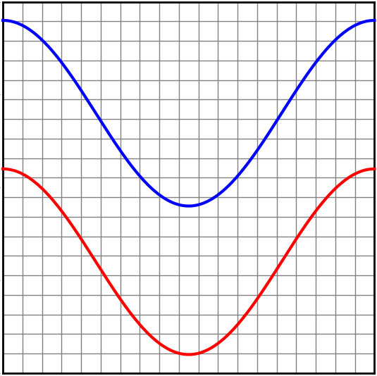
A network with just an input layer and an output layer tries to divide the two classes with a straight line.
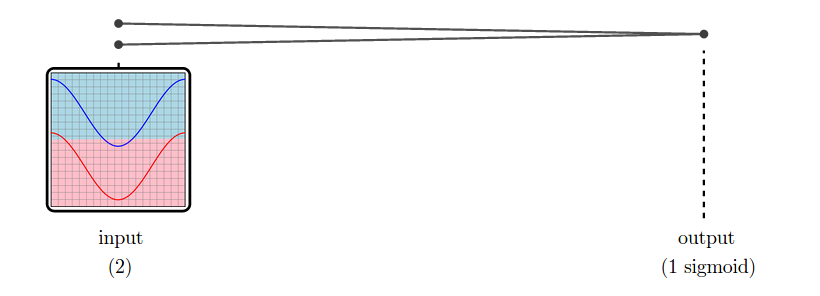
In the case of this dataset, it is not possible to classify it perfectly by dividing it with a straight line. And so, a network with only an input layer and an output layer can not classify it perfectly.
But, in practice, neural networks have additional layers in the middle, called “hidden” layers. These layers warp and reshape the data to make it easier to classify.
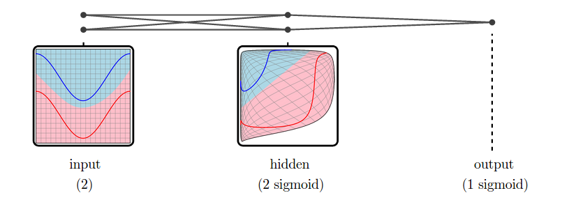
We call the versions of the data corresponding to different layers representations.1 The input layer’s representation is the raw data. The middle “hidden” layer’s representation is a warped, easier to classify, version of the raw data.
Low-dimensional neural networks are really easy to reason about because we can just look at their representations, and at how one representation transforms into another. If we have a question about what it is doing, we can just look. (There’s quite a bit we can learn from low-dimensional neural networks, as explored in my post Neural Networks, Manifolds, and Topology.)
Unfortunately, neural networks are usually not low-dimensional. The strength of neural networks is classifying high-dimensional data, like computer vision data, which often has tens or hundreds of thousands of dimensions. The hidden representations we learn are also of very high dimensionality.
For example, suppose we are trying to classify MNIST. The input representation, MNIST, is a collection of 784-dimensional vectors! And, even for a very simple network, we’ll have a high-dimensional hidden representation. To be concrete, let’s use one hidden layer with a hundred sigmoid neurons.
While we can’t visualize the high-dimensional representations directly, we can visualize them using dimensionality reduction. Below, we look at nearest neighbor graphs of MNIST in its raw form and in a hidden representation from a trained MNIST network.
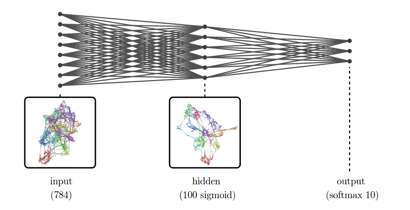
At the input layer, the classes are quite tangled. But, by the next layer, because the model has been trained to distinguish the digit classes, the hidden layer has learned to transform the data into a new representation in which the digit classes are much more separated.
This approach, visualizing high-dimensional representations using dimensionality reduction, is an extremely broadly applicable technique for inspecting models in deep learning.
In addition to helping us understand what a neural network is doing, inspecting representations allows us to understand the data itself. Even with sophisticated dimensionality reduction techniques, lots of real world data is incomprehensible – its structure is too complicated and chaotic. But higher level representations tend to be simpler and calmer, and much easier for humans to understand.
(To be clear, using dimensionality reduction on representations isn’t novel. In fact, they’ve become fairly common. One really beautiful example is Andrej Karpathy’s visualizations of a high-level ImageNet representation. My contribution here isn’t the basic idea, but taking it really seriously and seeing where it goes.)
Example 1: Word Embeddings
Word embeddings are a remarkable kind of representation. They form when we try to solve language tasks with neural networks.
For these tasks, the input to the network is typically a word, or multiple words. Each word can be thought of as a unit vector in a ridiculously high-dimensional space, with each dimension corresponding to a word in the vocabulary. The network warps and compresses this space, mapping words into a couple hundred dimensions. This is called a word embedding.
In a word embedding, every word is a couple hundred dimensional vector. These vectors have some really nice properties. The property we will visualize here is that words with similar meanings are close together.
(These embeddings have lots of other interesting properties, besides proximity. For example, directions in the embedding space seems to have semantic meaning. Further, difference vectors between words seem to encode analogies. For example, the difference between woman and man is approximately the same as the difference between queen and king:
To visualize the word embedding in two dimensions, we need to choose a dimensionality reduction technique to use. t-SNE optimizes for keeping points close to their neighbors, so it is the natural tool if we want to visualize which words are close together in our word embedding.
Examining the t-SNE plot, we see that neighboring words tend to be related. But there’s so many words! To get a higher-level view, lets highlight a few kinds of words.2 We can see areas corresponding to cities, food, body parts, feelings, relatives and different “travel” verbs.
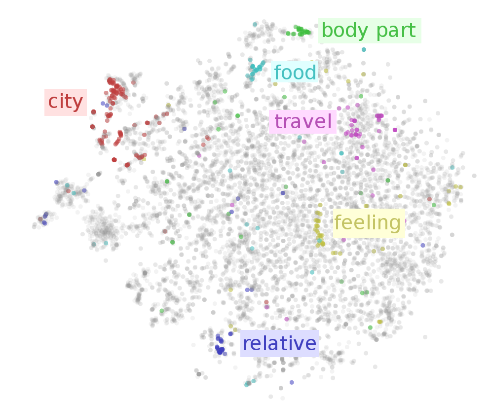
That’s just scratching the surface. In the following interactive visualization, you can choose lots of different categories to color the words by. You can also inspect points individually by hovering over them, revealing the corresponding word.
(Hover over a point to see the word.)
(See this with 50,000 points!)
Looking at the above visualization, we can see lots of clusters, from broad clusters like regions (region.n.03) and people (person.n.01), to smaller ones like body parts (body_part.n.01), units of distance (linear_unit.n.01) and food (food.n.01). The network successfully learned to put similar words close together.
Example 2: Paragraph Vectors of Wikipedia
Paragraph vectors, introduced by Le & Mikolov (2014), are vectors that represent chunks of text. Paragraph vectors come in a few variations but the simplest one, which we are using here, is basically some really nice features on top of a bag of words representation.
With word embeddings, we learn vectors in order to solve a language task involving the word. With paragraph vectors, we learn vectors in order to predict which words are in a paragraph.
Concretely, the neural network learns a low-dimensional approximation of word statistics for different paragraphs. In the hidden representation of this neural network, we get vectors representing each paragraph. These vectors have nice properties, in particular that similar paragraphs are close together.
Now, Google has some pretty awesome people. Andrew Dai, Quoc Le, and Greg Corrado decided to create paragraph vectors for some very interesting data sets. One of those was Wikipedia, creating a vector for every English Wikipedia article. I was lucky enough to be there at the time, and make some neat visualizations. (See Dai, et al. (2014))
Since there are a very large number of Wikipedia articles, we visualize a random subset. Again, we use t-SNE, because we want to understand what is close together.
The result is that we get a visualization of the entirety of Wikipedia. A map of Wikipedia. A large fraction of Wikipedia’s articles fall into a few broad topics: sports, music (songs and albums), films, species, and science. I wouldn’t have guessed that! Why, for example, is sports so massive? Well, it seems like many individual athletes, teams, stadiums, seasons, tournaments and games end up with their own articles – that adds up to a lot of articles! Similar reasons lead to the large music, films and species clusters.
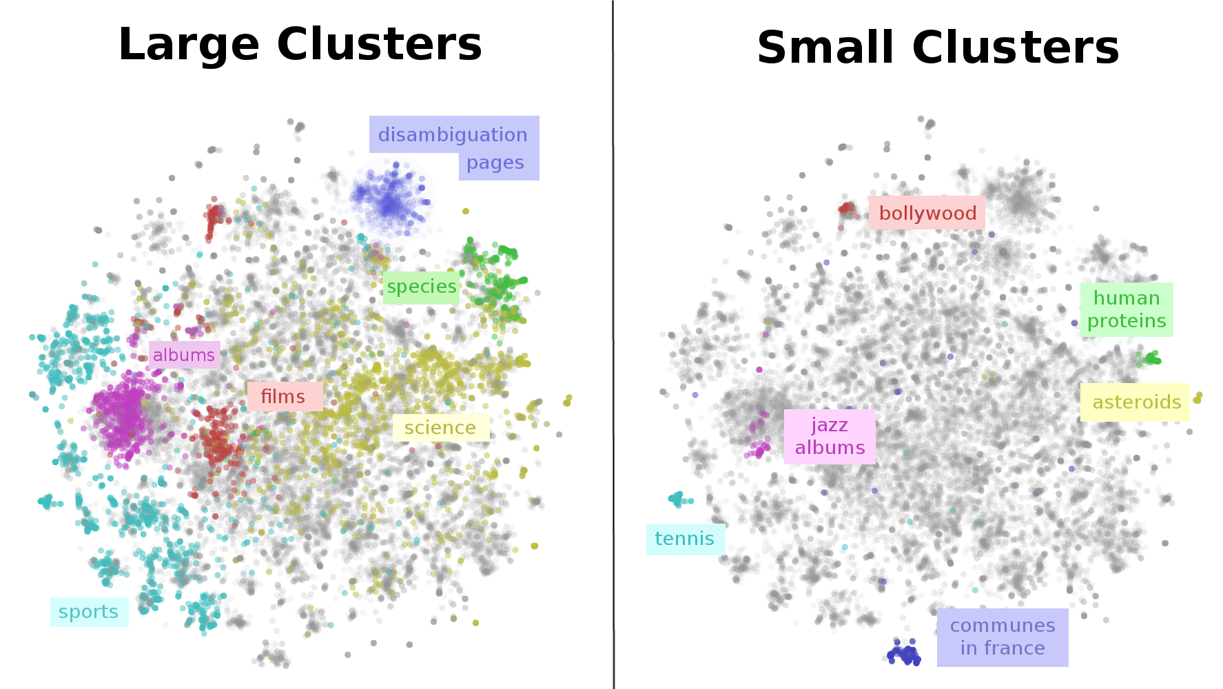
This map of Wikipedia presents important structure on multiple scales. While, there is a large cluster for sports, there are sub-clusters for individual sports like tennis. Films have a separate cluster for non-Western films, like bollywood. Even very fine grained topics, like human proteins, are separated out!
Again, this is only scratching the surface. In the following interactive visualization, you can explore for your self. You can color points by their Wikipedia categories, or inspect individual points by hovering to see the article title. Clicking on a point will open the article.
(Hover over a point to see the title. Click to open article.)
(See this with 50,000 points!)
(Note: Wikipedia categories can be quite unintuitive and much broader than you expect. For example, every human is included in the category applied ethics because humans are in peoplewhich is in personhood which is in issues in ethics which is in applied ethics.)
from: http://colah.github.io/posts/2015-01-Visualizing-Representations/
- 可视化深度学习和人类感知Visualizing Representations: Deep Learning and Human Beings-1
- 可视化深度学习和人类感知Visualizing Representations: Deep Learning and Human Beings-3
- 可视化深度学习和人类感知Visualizing Representations: Deep Learning and Human Beings-2
- Visualizing Representations: Deep Learning and Human Beings 简单翻译(数据可视化:深度学习和人类)(未完)
- 深度学习,自然语言处理,表达Deep Learning, NLP, and Representations
- Deep Learning, NLP, and Representations 深度学习,自然语言处理以及其表达式
- Deep Learning, NLP, and Representations
- 【deep learning学习笔记】Distributed Representations of Sentences and Documents
- 【转载】Deep Learning, NLP, and Representations
- Neural Networks and Deep Learning 神经网络和深度学习book
- Neural Networks and Deep Learning 神经网络和深度学习
- Deep learning学习笔记(2):Visualizing and Understanding Convolutional Networks(ZF-net)
- 深度学习和浅层学习 Deep Learning and Shallow Learning
- Deep Learning深度学习
- Deep learning -深度学习
- Deep Learning(深度学习)
- 深度学习Deep learning
- 深度学习(Deep Learning)
- select标签中显示指定内容
- Java内存区域划分
- ROS基础环境的配置
- zoj2876——May Day Holiday(算星期)
- URL链接中汉字乱码转UTF-8和gb2312
- 可视化深度学习和人类感知Visualizing Representations: Deep Learning and Human Beings-1
- Java并发编程系列之八:wait()、notify()和notifyAll()
- zoj3878——Convert QWERTY to Dvorak
- Micro2440开发板启动Linux
- CUDA tool URL
- [NOIP2013][CODEVS3287]货车运输(kruskal+树上倍增)
- 1131: 【C语言训练】斐波纳契数列
- 感悟
- Everyone is differnet