WPF教程(二十四)Canvas
来源:互联网 发布:从零开始学淘宝美工 编辑:程序博客网 时间:2024/06/05 11:59
Canvas大概是最简单的面板了。在默认情况下,它什么都不做,你把控件放到它里面,然后通过具体的坐标来指定位置。
如果你之前使用过其他UI库如WinForms,Canvas会让你感觉很亲切。然而它趋向于使用绝对坐标来控制子控件,如果你固定了文字的位置,或者内容是固定大小的,一旦用户调整窗口大小,面板不会做任何事情来调整。
我们先来看例子,看看Canvas在默认情况下是如何工作的:
<span style="font-size:14px;"><Window x:Class="WpfTutorialSamples.Panels.Canvas" xmlns="http://schemas.microsoft.com/winfx/2006/xaml/presentation" xmlns:x="http://schemas.microsoft.com/winfx/2006/xaml" Title="Canvas" Height="200" Width="200"> <Canvas> <Button>Button 1</Button> <Button>Button 2</Button> </Canvas></Window></span>
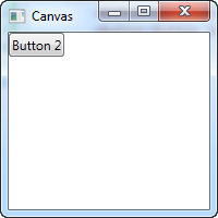
如你所见,我们创建了两个按钮,但是它们显示在同一个位置,因此只能看到最后创建的那个。Canvas不会做任何事,除非你给子控件指定坐标。这需要通过Left、Right、Top和Bottom这四个附加属性来设定。
这些属性用来指定相对于Canvas四个边缘的位置。默认情况下都被设置为NaN(Not a Number),也就是Canvas的左上角。你可以像下面这样改变它们:
<span style="font-size:14px;"><Window x:Class="WpfTutorialSamples.Panels.Canvas" xmlns="http://schemas.microsoft.com/winfx/2006/xaml/presentation" xmlns:x="http://schemas.microsoft.com/winfx/2006/xaml" Title="Canvas" Height="200" Width="200"> <Canvas> <Button Canvas.Left="10">Top left</Button> <Button Canvas.Right="10">Top right</Button> <Button Canvas.Left="10" Canvas.Bottom="10">Bottom left</Button> <Button Canvas.Right="10" Canvas.Bottom="10">Bottom right</Button> </Canvas></Window></span>
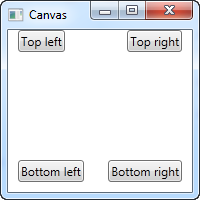
注意我只设置了我需要的属性。前两个按钮,我只指定X坐标的值,使用Left和Right属性来使它们分别从两端朝中间靠拢。对于两个底部按钮,我使用了Left/Right和Bottom属性来使它们向中间靠拢。通常情况下,你需要指定Top和Bottom其中的一个,以及Left和Right其中的一个。
Canvas可以完全控制控件的位置,但是它不知道是否有足够的空间放下全部控件,也不知道一个是否在另一个上面。这一点非常不利于各种对话框的设计。但是,如Canvas的名字所示,它至少有一个强大的功能:Painting。WPF里面有很多控件支持放入一个Canvas,来展示漂亮的图标。
Z-Index
在下面的例子,我们将使用一组WPF形状相关的控件来例证另外一个使用Canvas时的重要概念:Z-Index。正常情况下,Canvas中的两个控件会重叠在一起,最后一个被定义的将覆盖另外一个。通过使用附加的Z-Index属性,可以轻松改变这种情况。
先来看不使用Z-Index的情况:
<span style="font-size:14px;"><Window x:Class="WpfTutorialSamples.Panels.CanvasZIndex" xmlns="http://schemas.microsoft.com/winfx/2006/xaml/presentation" xmlns:x="http://schemas.microsoft.com/winfx/2006/xaml" Title="CanvasZIndex" Height="275" Width="260"> <Canvas> <Ellipse Fill="Gainsboro" Canvas.Left="25" Canvas.Top="25" Width="200" Height="200" /> <Rectangle Fill="LightBlue" Canvas.Left="25" Canvas.Top="25" Width="50" Height="50" /> <Rectangle Fill="LightCoral" Canvas.Left="50" Canvas.Top="50" Width="50" Height="50" /> <Rectangle Fill="LightCyan" Canvas.Left="75" Canvas.Top="75" Width="50" Height="50" /> </Canvas></Window></span>
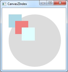
由于方框都是在圆之后定义的,因此都覆盖了圆。而方框又按定义的先后被层层覆盖,后定义的覆盖先定义的。后下面我们来作如下改变:
<span style="font-size:14px;"><Window x:Class="WpfTutorialSamples.Panels.CanvasZIndex" xmlns="http://schemas.microsoft.com/winfx/2006/xaml/presentation" xmlns:x="http://schemas.microsoft.com/winfx/2006/xaml" Title="CanvasZIndex" Height="275" Width="260"> <Canvas> <Ellipse Panel.ZIndex="2" Fill="Gainsboro" Canvas.Left="25" Canvas.Top="25" Width="200" Height="200" /> <Rectangle Panel.ZIndex="3" Fill="LightBlue" Canvas.Left="25" Canvas.Top="25" Width="50" Height="50" /> <Rectangle Panel.ZIndex="2" Fill="LightCoral" Canvas.Left="50" Canvas.Top="50" Width="50" Height="50" /> <Rectangle Panel.ZIndex="4" Fill="LightCyan" Canvas.Left="75" Canvas.Top="75" Width="50" Height="50" /> </Canvas></Window></span>
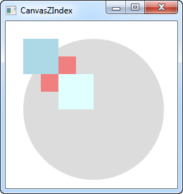
默认的Z-Index值都是0,我们给每一个形状加上值。值大的会在上面,覆盖值小的。如果值相等,那么按定义先后来覆盖。截屏很清楚的展示了Z-Index改变后的样子。
- WPF教程(二十四)Canvas
- WPF教程(十四)文本框
- (十四)Visualization教程二
- WPF教程(二) WPF vs WinForms
- NeHe OpenGL教程 (二十四)
- c++教程(二十四:Preprocessor directives)
- WPF教程(二十三)WPF面板简介
- WPF教程(二十)密码框
- WPF教程(二十一)工具提示
- WPF教程(二十二)文本呈现
- WPF教程(二十五)WrapPanel
- WPF教程(二十六)StackPanel
- WPF教程(二十七)DockPanel
- WPF教程(二十八)Grid
- C#开发WPF/Silverlight动画及游戏系列教程(Game Tutorial):(二十四) Be careful!前方怪物出没
- OpenGL教程翻译 第二十四课 阴影贴图(二)
- 自定义控件三部曲之绘图篇(十四)——Canvas与图层(二)
- 自定义控件三部曲之绘图篇(十四)——Canvas与图层(二)
- 【Unity技巧】四元数(Quaternion)和旋转
- c#之文件操作
- Leetcode 54 spiral matrix II (螺旋矩阵)
- Android 之在Activity中fragment相互通信
- 为什么DCDC的效率一般情况下要比LDO高
- WPF教程(二十四)Canvas
- Google原生下拉刷新组件SwipeRefreshLayout
- java可视化打开文件
- 反射调用
- linux内核源码总览之四---------kernel目录
- 关于nginx+tomcat搭建反向代理时路径和端口问题
- js-随机产生一个由10个元素组成的数组
- MFC点击对话框的X按钮使其最小化
- 总结:项管成本管理计算公式