WPF教程(二十一)工具提示
来源:互联网 发布:bootstrap.js下载 编辑:程序博客网 时间:2024/06/11 12:16
工具提示有各种叫法,意思都是一样的:在鼠标停留在某一个控件或者某个链接上时,显示其对应的额外信息。WPF中通过使用FrameworkElement基类中的ToolTip属性来实现,几乎所有控件都继承于此类。
为控件指定一个工具提示非常简单,如下:
<span style="font-size:14px;"><Window x:Class="WpfTutorialSamples.Control_concepts.ToolTipsSimpleSample" xmlns="http://schemas.microsoft.com/winfx/2006/xaml/presentation" xmlns:x="http://schemas.microsoft.com/winfx/2006/xaml" Title="ToolTipsSimpleSample" Height="150" Width="400"> <Grid VerticalAlignment="Center" HorizontalAlignment="Center"> <Button ToolTip="Click here and something will happen!">Click here!</Button> </Grid></Window></span>
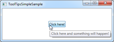
截屏中你可以看到,一旦鼠标停留在按钮上,就会出现一个浮动的小框,显示了具体的信息。大部分UI框架都提供这个信息——就显示一行文字。
但是,在WPF中,ToolTip属性实际上不是一个字符串类型,而是一个对象类型,也就是说我们可以把任何东西放到里面。这样的开放方式使得很多可能得以实现,从而给用户提供非常丰富有帮助的提示。
<span style="font-size:14px;"><Window x:Class="WpfTutorialSamples.Control_concepts.ToolTipsAdvancedSample" xmlns="http://schemas.microsoft.com/winfx/2006/xaml/presentation" xmlns:x="http://schemas.microsoft.com/winfx/2006/xaml" Title="ToolTipsAdvancedSample" Height="200" Width="400" UseLayoutRounding="True"> <DockPanel> <ToolBar DockPanel.Dock="Top"> <Button ToolTip="Create a new file"> <Button.Content> <Image Source="/WpfTutorialSamples;component/Images/page_white.png" Width="16" Height="16" /> </Button.Content> </Button> <Button> <Button.Content> <Image Source="/WpfTutorialSamples;component/Images/folder.png" Width="16" Height="16" /> </Button.Content> <Button.ToolTip> <StackPanel> <TextBlock FontWeight="Bold" FontSize="14" Margin="0,0,0,5">Open file</TextBlock> <TextBlock> Search your computer or local network <LineBreak /> for a file and open it for editing. </TextBlock> <Border BorderBrush="Silver" BorderThickness="0,1,0,0" Margin="0,8" /> <WrapPanel> <Image Source="/WpfTutorialSamples;component/Images/help.png" Margin="0,0,5,0" /> <TextBlock FontStyle="Italic">Press F1 for more help</TextBlock> </WrapPanel> </StackPanel> </Button.ToolTip> </Button> </ToolBar> <TextBox> Editor area... </TextBox> </DockPanel></Window></span>
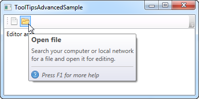
第一个按钮用了非常简单的一行文字作为提示。第二个按钮使用一个容器作为根控件,然后得以把我们想要的控件放进去。结果很酷:一个标题、一段描述以及一个图标,提示你可以按F1获取更多帮助。
高级选项
在ToolTipService类中,有一些实用的属性,用于改变工具提示的展示。你可以直接在支持工具提示的控件里设置这些属性,例如,通过使用ShowDuration属性来延长提示的显示时间(这里设置了5秒)
<span style="font-size:14px;"> <Button ToolTip="Create a new file" ToolTipService.ShowDuration="5000" Content="Open" /></span>你还可以使用HasDropShadow属性来设置弹出框是否带阴影,使用ShowOnDisabled属性来设置不可用控件是否需要显示提示。还有很多其他的功能,请参阅以下链接:http://msdn.microsoft.com/en-us/library/system.windows.controls.tooltipservice.aspx
总结
工具提示对用户帮助很大,在WPF中,使用简单且非常灵活。在你的应用中,通过使用ToolTipService类的属性来设计工具提示,以创建一个用户友好的内联帮助系统。
0 0
- WPF教程(二十一)工具提示
- WPF教程(十一)WPF中的命令行参数
- WPF教程(二) WPF vs WinForms
- NeHe OpenGL教程 (二十一)
- Swift中文教程(二十一) 协议
- c++教程(二十一: Polymorphism)
- Golang教程:(二十一)协程
- WPF教程(二十三)WPF面板简介
- WPF教程(二十)密码框
- WPF教程(二十二)文本呈现
- WPF教程(二十四)Canvas
- WPF教程(二十五)WrapPanel
- WPF教程(二十六)StackPanel
- WPF教程(二十七)DockPanel
- WPF教程(二十八)Grid
- linq中文教程(二十一)
- C#开发WPF/Silverlight动画及游戏系列教程(Game Tutorial):(二十一)主位式地图移动模式
- Visual Studio 2008 每日提示(二十一)
- HDU 1455Sticks 解题报告
- HDU 1024 Max Sum Plus Plus(DP)
- 二分查找
- 洛谷 P1965 转圈游戏
- ADC_ScanConvMode_ADC_ContinuousConvMode_EOC
- WPF教程(二十一)工具提示
- python代码生成验证码
- 隐藏状态栏
- java错题集之String(2)
- sam格式详解
- riot写一个timeline标签
- 《gradle教程系列》一.gradle简介
- C++中的static关键字的总结
- NYOJ-456-邮票分你一半(01背包)